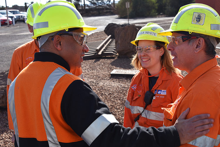
Whyalla featured on hit documentary series Australian Story
In September 2018, the ABC’s hit documentary series Australian Story tracked ...
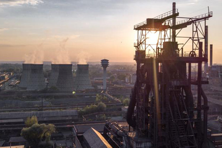
Since then, we’ve grown significantly, with operations now spanning four continents and over 14,000 employees.
The pace of our expansions makes our decoupled integration model a flagship for a more viable long-term future across the globe and establishes our position as the new powerhouse of industrial growth.
To support our unified strategy across the world, GFG Alliance recently rolled out a brand refresh, including an updated logo design, retaining our core symbol the flame and a new colour pallet.
New templates are available in Australia on the brand hub, and the new branding will progressively be rolled out across the globe.
Our Executive Chairman, Sanjeev Gupta, said
I encourage everyone to embrace our new branding – this is an exciting milestone in reinforcing our core values of Family, Sustainability and Change.
This refresh celebrates our global success and will continue to unite and drive us forward in pursuit of a new industrial renaissance across our regions.
The flame is a symbol of unity for the Alliance, it’s the common link between all GFG businesses globally.
The flame signifies the common vision that we all share – it has industrial growth at its heart but we want to create a better future for future generations, our children and our communities.
The flame galvanises and inspires us as we strive to see things differently and re-shape our industries for the future generations.
Sanjeev said:
When I first formed the company in February 1992, I was inspired by the flame on the Statue of Liberty, which represents passion and change.
We’re in the metals business and it’s of course formed with fire, but even more so, the flame was chosen as a meaningful symbol and continues to represent key aspects of our corporate philosophy.
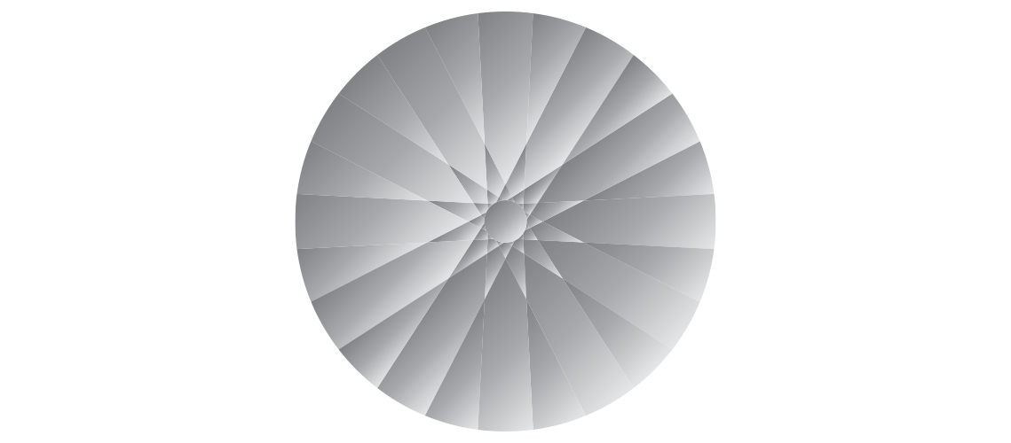
The wheel and spokes are a strong symbol of the Alliance’s heritage, originating from one of the Gupta family’s early manufacturing businesses, Victor Bikes.
The wheel is as much a visual representation of our future as our heritage. The steel and metals we manufacture and distribute are underpinning the construction of a new world, in a new way.
More powerfully though it is a representation of our commitment to the circular economy and our sustainable strategies of reusing, upcycling and recycling materials and powering with renewable energy as much possible.
The wheel symbolises our sustainable industrial and manufacturing model. The spokes in the wheel represent the people, businesses and territories that come together to form the backbone of our business.
The wheel also symbolises our appetite for constant change and forward movement – whether it be the commercialisation of new technologies, the regeneration of manufacturing and engineering skills, or adding value by doing things differently.
Challenging the status quo is the prevailing spirit of all our companies.
In September 2018, the ABC’s hit documentary series Australian Story tracked ...
Liberty’s European steel acquisitions are set to double the Group’s global ...
Leave A Reply